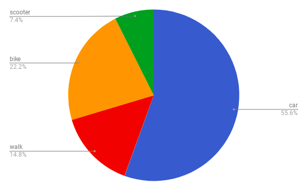
This week in maths we learned about graphs and charts. On Google Sheets I made this pie graph. This shows the way people get to school. It shows that 55.6% people come to school by car and the 2nd highest is bike which is at 22.2% and the least is people on a scooters with 7.4%.

No comments:
Post a Comment